
Texada Elementary School has a new look!
This logo didn’t come from a single idea, but from ongoing conversations with students, staff, families, and community members.
During the process, two themes emerged again and again: connection to place and history.
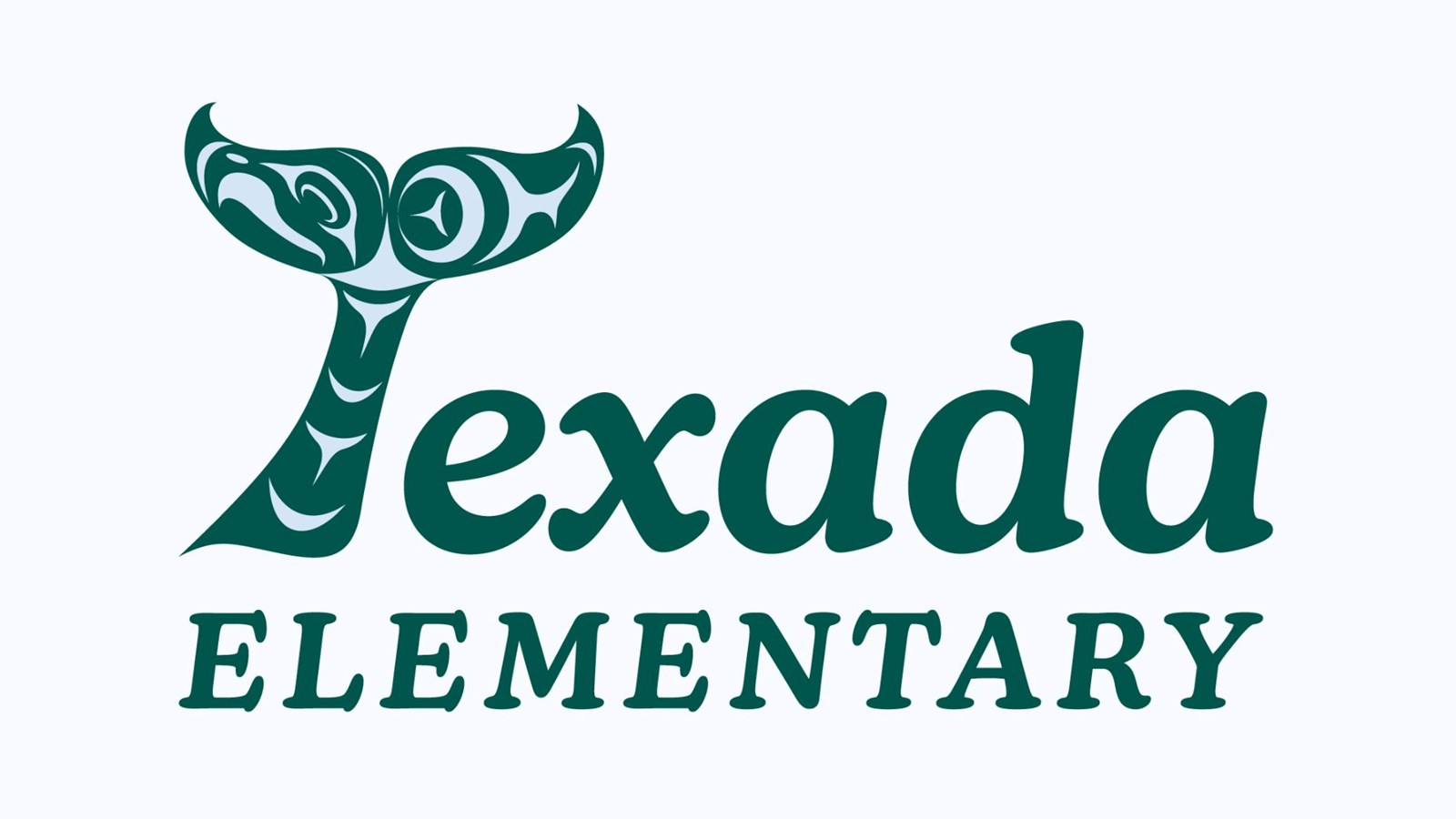
Surrounded by the waters of the Salish Sea, the whale emerged as the strongest and most widely embraced symbol. Whales are commonly seen in the waters around Texada Island, reflecting everyday life in the community.
The choice also carries forward an important piece of the school’s history, honouring the original orca logo that served the school community for many years and became a cherished part of Texada Elementary’s identity. As far as records show, the logo dates back to at least the 1980s! This refresh provided an opportunity to celebrate the school’s legacy while creating a beautiful design that will serve the school well into the future.
If you look closely within the whale tail, you may notice the face of an eagle. With eagles nesting just behind the school, they are a familiar and powerful presence, one that students and families felt was important to be reflected.
The green and light blue were chosen to reflect the natural beauty that surrounds and sustains the Texada community. From the island's lush forests to the ocean that connects, nourishes and shapes daily life, these landscapes are more than a backdrop, they are part of the community's identity, influencing routines, stories, and even students' dreams!
Texada Elementary’s new visual identity is a reflection of place, shared stories, and the voices that helped shape it.
A special thank you to Tla’amin artist Kobe Galligos for bringing this vision to life through his beautiful artwork, and to local graphic designer Rachelle Harvey for thoughtfully integrating it with the typography.